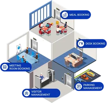
Mission
To empower Facility Managers and Workplace Experience Managers with visibility, control and cost savings so that they can create a collaborative and productive workplace experience for the employees.

BRAND HUB
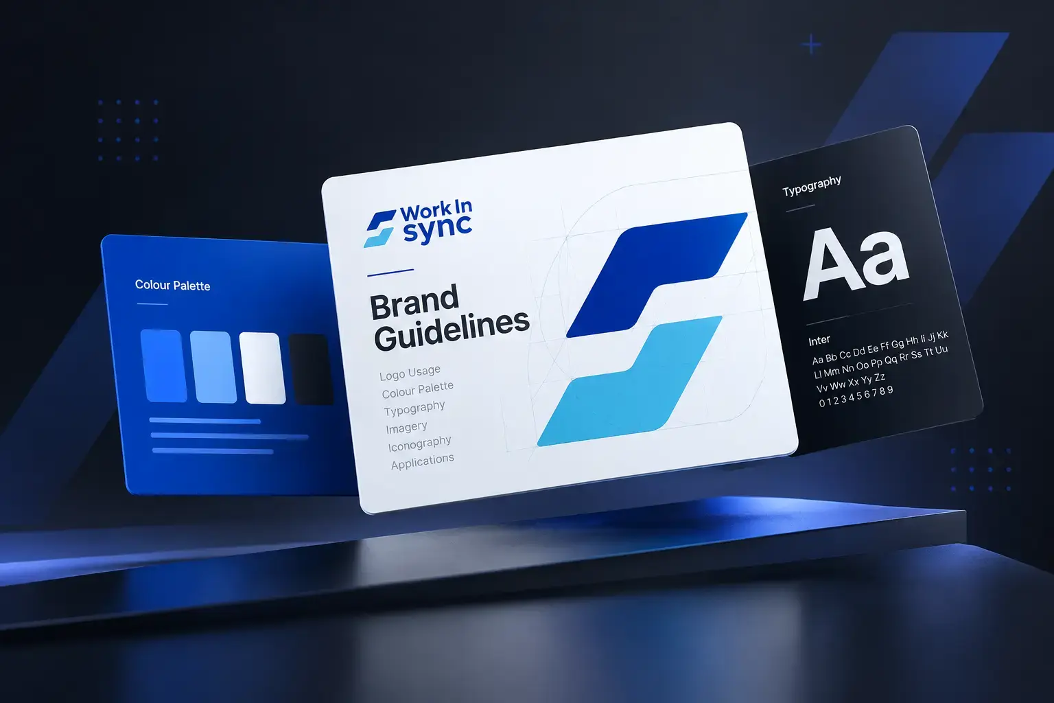
Everything you need to represent WorkInSync correctly: official logos, colours, typography, imagery and brand guidelines, all in one place.
Last updated: October 2026
01 - Overview
WorkInSync™ is an enterprise workplace management platform that simplifies modern workplace operations through intelligent, scalable and seamless solutions. Organisations use it to manage desk booking, meeting rooms, visitors, parking, cafeterias, floor kiosks, assets, service requests and workplace analytics in one platform. WorkInSync is a MoveInSync product.
To empower Facility Managers and Workplace Experience Managers with visibility, control and cost savings so that they can create a collaborative and productive workplace experience for the employees.
To become an operating system for workplaces by enabling a fully connected, data-driven and easy-to-adopt platform for corporate employees.
Transforming workplaces into strategic assets.
02 - Using the Brand
Use our name and logo to refer to WorkInSync accurately, and only with the official files on this page.
Always one word. For integrations, write 'Acme Room Sensor for WorkInSync'.
Use WorkInSync™ on first mention in formal and printed materials. After that, write WorkInSync.
WorkInSync is a MoveInSync product. Use the full logo with 'A MoveInSync Product' on websites, decks and print; use the primary logo in product UI and small spaces.
WorkInSync™ and the WorkInSync logo are trademarks of MoveInSync. Using them under these guidelines does not create a partnership or endorsement. We may update these guidelines at any time.
03 - Guidelines
The complete WorkInSync brand book: logo, colour, typography, imagery and layouts in one 33-page document.
04 - Logo
The WorkInSync logo combines two overlapping shapes that represent the desk and chair and show the synchronisation of various aspects in the modern workplace, with the WorkInSync wordmark. Always use the official files. Never recreate the logo.
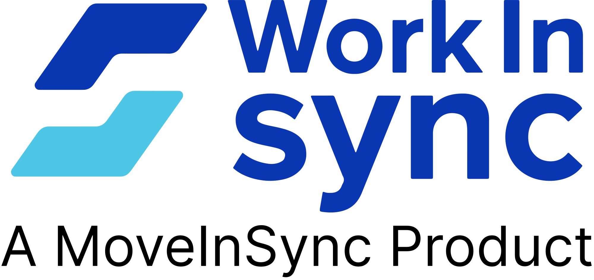
Icon + wordmark + “A MoveInSync Product”. Use it in brand documents and high-visibility print.
Icon + wordmark. Use it in all everyday digital and print materials.

The desk-and-chair mark on its own. Use it for social media profile pictures, app icons and favicons.
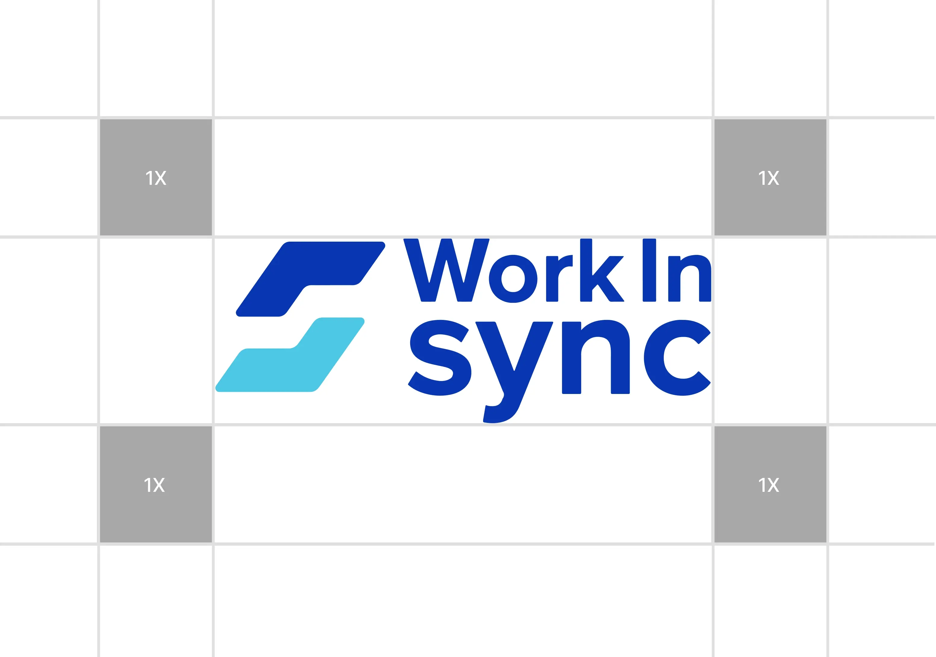
Keep clear space equal to the height of the logo icon (1X) on all sides.
Minimum size: full logo 120 px wide on screen, 30 mm in print. Icon 24 px on screen (16 px only as a favicon), 6 mm in print.



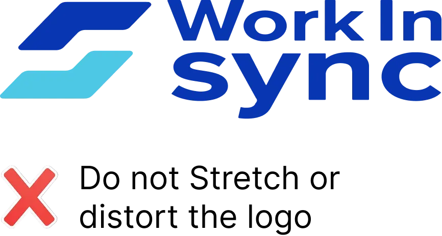
Don't stretch or distort the logo.
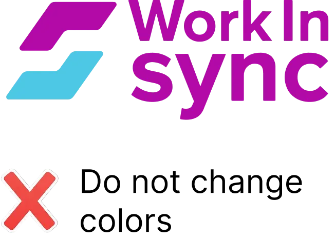
Don't change the logo colours.
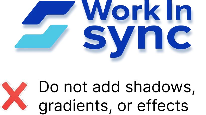
Don't add shadows, gradients or effects.
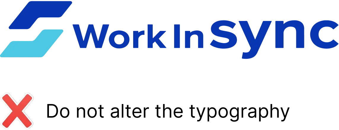
Don't alter the typography.
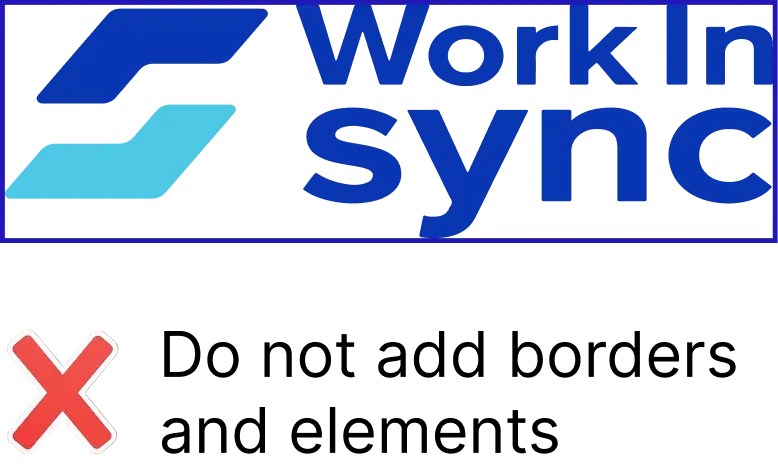
Don't add borders or outlines.
Don't use a low-resolution or blurry logo.
Don't alter the logo's proportions.
Don't rotate the logo.
Don't place the logo on low-contrast backgrounds.
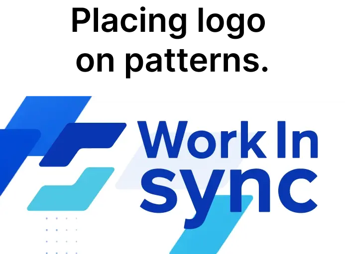
Don't place the logo on busy patterns.
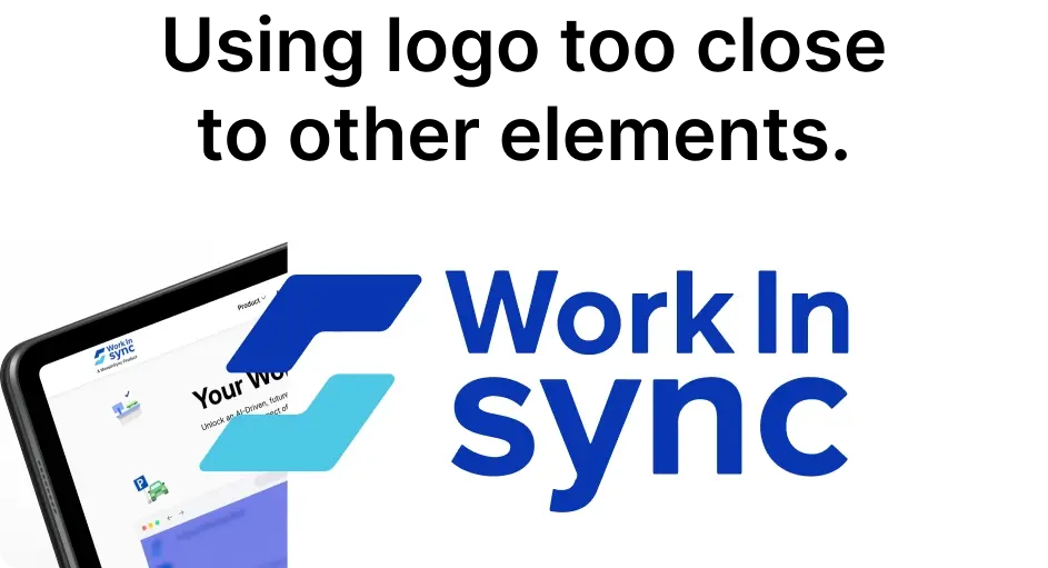
Don't crowd the logo with other elements.
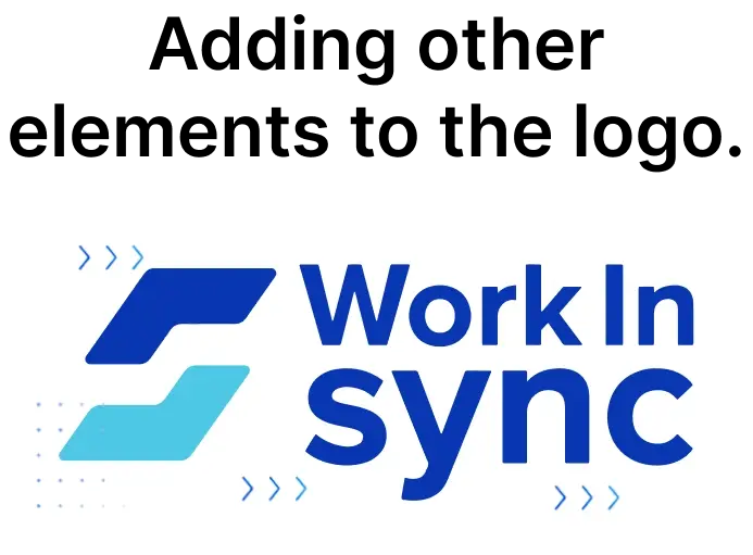
Don't add other elements to the logo.
05 - Colour
Our colour system is built around Royal Blue, representing trust, intelligence and professionalism, supported by calm neutrals for balance and readability.
| Pair | Contrast ratio | Use for |
|---|---|---|
| Royal Blue #0937B2 on White | 9.5:1 | Text and buttons |
| Gunmetal #2B2F39 on White | 13.4:1 | Body text |
| White on Royal Blue | 9.5:1 | Buttons, dark sections |
| Success #22BB33 on White | 2.6:1 | Icons and fills only; use #1A7F2B for text |
| Error #E4626F on White | 3.4:1 | Icons only; use #C4313F for text |
| Warning #CC3300 on White | 5.9:1 | Text and icons |
Use Royal Blue for primary actions and emphasis only. Most surfaces should be white or Blue Light Shade, so blue keeps its impact.
06 - Typography
Inter is our only typeface. It is modern, highly readable and works equally well in content-heavy pages and product interfaces.
Aa
Inter
Open source · SIL Open Font License
ABCDEFGHIJKLMNOPQRSTUVWXYZ / abcdefghijklmnopqrstuvwxyz / 0123456789 !@#&?
Aa
Regular
400
Aa
Medium
500
Aa
Semi Bold
600
Aa
Bold
700
Display
56 / 64 · Bold 700 · -2%
Transforming workplaces into strategic assets.
H1
40 / 48 · Bold 700 · -1.5%
Transforming workplaces into strategic assets.
H2
32 / 40 · Semi Bold 600 · -1%
Transforming workplaces into strategic assets.
H3
24 / 32 · Semi Bold 600
Transforming workplaces into strategic assets.
Body
16 / 26 · Regular 400
Transforming workplaces into strategic assets.
Caption
13 / 18 · Regular 400
Transforming workplaces into strategic assets.
WORKPLACE PLATFORM
Transforming workplaces into strategic assets.
1 Caption · 2 Display · 3 Body
Highlight one key word in Royal Blue.
Don't mix Inter with other typefaces.
Don't set body text below 14px.
07 - Imagery
Our photography is clean, bright and enterprise-focused: real workplaces, real people and our product in context.
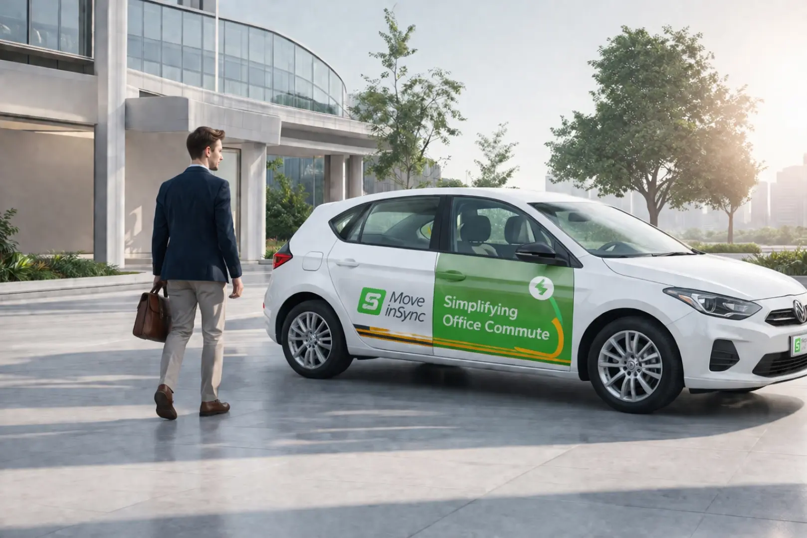
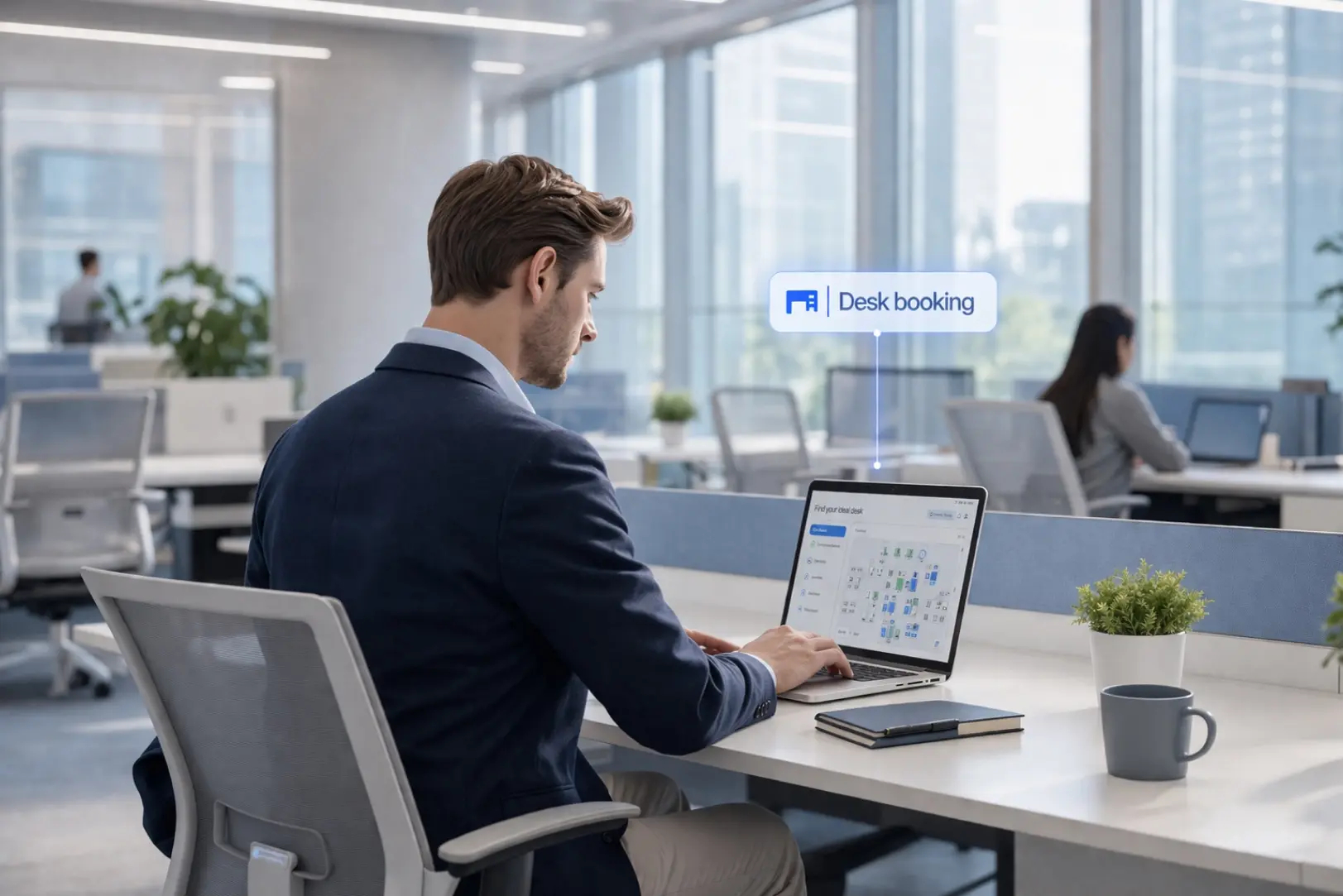


Avoid dark, moody or cluttered scenes.
Avoid generic stock clichés and competitor branding.
08 - Patterns
Our geometric pattern system (parallelograms, dot grids, cross markers and outline squares) adds structure and depth. Use it as subtle texture, never as the hero.


09 - Voice
WorkInSync sounds professional, intelligent and friendly, like a trusted workplace colleague. We are clear, measured and enterprise-forward.
We speak to decision-makers with confidence and precision.
We lead with insight and data, not hype.
We simplify complexity. No noise, no jargon overload.
10 - Downloads
Official WorkInSync brand assets. By downloading, you agree to use them in line with these guidelines.
Everything in one download: logos, app icons, colour palette, Inter fonts, patterns and the brand guidelines.
ZIP · 28.4 MB
Full brand book, 33 pages
PDF · 12.3 MB
All WorkInSync logos in colour, white and black, as SVG, PNG and PDF.
ZIP · 0.85 MB
The WorkInSync icon, favicon.ico and app icons from 16 to 512 px.
ZIP · 0.22 MB
11 - Contact
Questions about using the WorkInSync brand, or need assets that aren’t here? Get in touch.
Questions about using the brand, need assets that aren't here, or writing about us? Get in touch.
Email hello@workinsync.ioWorkInSync™ is an enterprise workplace management platform that simplifies modern workplace operations through intelligent, scalable and seamless solutions. Organisations use it to manage desk booking, meeting rooms, visitors, parking, cafeterias, floor kiosks, assets, service requests and workplace analytics in one platform. WorkInSync is a MoveInSync product.
Ready to see how much space you're overpaying for? Talk to a WorkInSync specialist and get a free utilization audit of your current footprint.